 For my second project I developed a map of the landscapes within a long day’s drive of my home. I have lived my life between Bellingham and Portland, along a damp trough between the Cascades and the North Pacific. Over time, and having traveled widely, have I developed a deeper sense of this place—just one place within a sea of places. This is my first attempt to render my home bioregions.
Home is a bird song and a rolling of the seasons? How far do I go before I am somewhere else? Bioregions are defined by their inhabitants. This project helped me remember nearby places I have already been. I also have a list of places I want to visit: the outer coast of Vancouver Island, the Frazer Plateau, the Blue Mountains, and the high divide of Valemount between the Frazer and Columbia.
Before I wander into my cartographic notes I want to credit David McKloskey, whose 1989 map of “Ish River Country” decorated my mother’s wall, and Stephen Freelan who commemorated the formal naming of the Salish Sea (and who helped build the Salish Sea Wiki), and Aquila Flower for her vision of a Salish Sea Atlas. I also want to acknowledge how raw the scars of colonization lie on this landscape and its people. The brutality towards the living earth and its indigenous people is fresh. We were born with blood on our hands, and that is another essay—the territory that is not the map. The place names used for our convenience are foreign words, and the Salish Sea is a global language loss hot spot. An update may be in order.
While I started the project with the intent of mapping bioregions, I realized that I am averse to the fascination with drawing distinct bioregional borders. Like when Sykes and Picot slit apart the Middle East in 1916, experts in rooms like to draw lines that mark other peoples lives. My aversion is not to whether the line is arbitrary and straight, or follows a watershed divide, or splits a river in half (practices all embraced by other empires). I suspect dividing the earth with lines has an effect on the mind and heart. The industrial project is in large part a process of defining standard processes that can be applied based on lines on maps. I am weary of that.
A bioregion is a story told from the place we stand. It grow in a family over time. Bioregional identity in other hands can also be abused to stir nationalist pride. From where we stand, the immediate details are crisp. As you look off to the horizon the land is fuzzy and vague with distance. I want to embrace these places, rather than mark their edges. Someone else, living over there can make their own map, and they can chose the center of their own world, to which I am likely peripheral. If we ever find an egalitarian bioregionalism I expect it will have fewer checkpoint borders, with more interesting neighbors. That is what I wanted to express in my map—a landscape full of interesting neighbors.
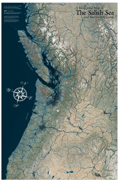
This map centers on my neighborhood—a populous core of Salmon Nation—a maritime temperate rainforest of around 10 million people. As you weave the inside passage north, as you cross the sagebrush plateau to the west flank of the Rockies, or venture through the Okanogan Highlands onto the Fraser Plateau, or wander out into the Basin and Range, or over Siskiyou Pass, you end up somewhere else. The Salish Sea is both distinct, and yet not separate from anywhere on Earth.
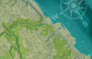
These release notes mostly talk about cartography. The base layers are designed to render the topographic and ecologic character of bioregions—hydrology, vegetation, and elevation. The focus is water; a tessellation of rivers and watersheds. Modernity is represented lightly by areas of population density and the roads that connect them. While there are many thresholds to cross, no borders are declared.
Base Layers
The base layer blends five rasters (spatially organized images) to create the underlying colors and textures of the land. Out of habit, I started with an Esri/Maxar aerial photograph. To accentuate the natural landcover, I tinted the photos using the 2017 WWF Ecoregion polygons. While exploring alternatives I noticed that WWF just borrowed the EPA’s level 3 eco-regions for their project. The data I plot usually come from public investments. Afterward private companies compete to monetize their use. I chose tints on a yellow to blue-green spectrum to represent a moisture gradient. An umber for drylands, olive for dry forests, green for mesic, and blue-green for rainforests. Both EPA and WWF acknowledge a Willamette oak savannah. It would be lovely to have a “historical savannah layer” that more represents the broader distribution of these fire-dependent indigenous perennial agroforestry landscapes, but that is another map.
Getting the topographic hillshade to print was an unexpected cartographic adventure. I started out using the Esri topobathy service, but the massive data layers failed to export well into final images—some unknowable internet tiling issue. To solve the problem, I ended up going to the source: recovering my user account, blundering through a bulk download wizard with the help of a few YouTube videos, and after much clicking, I had gathered a swath of the Shuttle Radar Topography Mission, distributed by USGS EarthExplorer. Around 200 tiles later I had a digital elevation model covering my map area. Another automated process spackled in gaps in the radar coverage, and this final elevation model was used to derive three more transparencies to finish up the base layer.
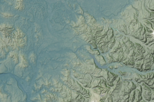
I first layered a semi-transparent grey-scale multi-directional hillshade. This muted the brightly tinted photos, and sculpted the mountains. The spine of the Cascades is the defining feature of the landscape. The maritime lowlands west of the mountains are distinctly mild, moderated by the ocean and wetted by the steady flow of clouds captured by the peaks. Following the experiments of John Nelson, I created a transparent blue haze across areas below 1500 feet elevation, and west of the mountains, using a color palette I would later use for rivers—my rendering of maritime influence. This took a green ecoregion and filled the wet valleys with fog leaving the east side by contrast crisp and dry.
 This east-west divide is important—my wet forest home is an isolated green crescent in the vast western landscape of dry-forest mountains, steppe, and grassland. Enough aerial imagery still shows through the hill-shade to add the textural marks of civilization. As a final touch, I took elevations above 4500 feet, just above the passes, and created a translucent white dusting of snow to reinforce the coldest mountains.
Rivers, Watersheds and Shorelines
The spotlight feature of this folio are the rivers and watersheds. When mapping in the United States I have abundant hydrologic data at my fingertips. Mapping across the US-Canada border involved some new territory. For me Canadian spatial data are difficult to find, and their user interfaces somehow manage to be more obscure than my own federal platforms. This is what it means to be an outsider. My vision for this map probably began with my discovery of the HydroSHED project, which uses the same SRTM elevation data I used for base layers to render a global dataset describing rivers and watersheds. As a bonus, they also map lakes, sparing me another international incident.
I keep coming back to the same teal-blue for running water, which is harmonious with the moist west-side base layers, and contrasts nicely with the warm-hued eastern drylands. For the watershed boundaries I chose a complementary contrast of a rusty orange-brown hue, but similar in saturation and tone. Watersheds and rivers are the focus of the study, and add enough detail of the surface, while interacting with the base layer hillshade. The challenge came with the watersheds.
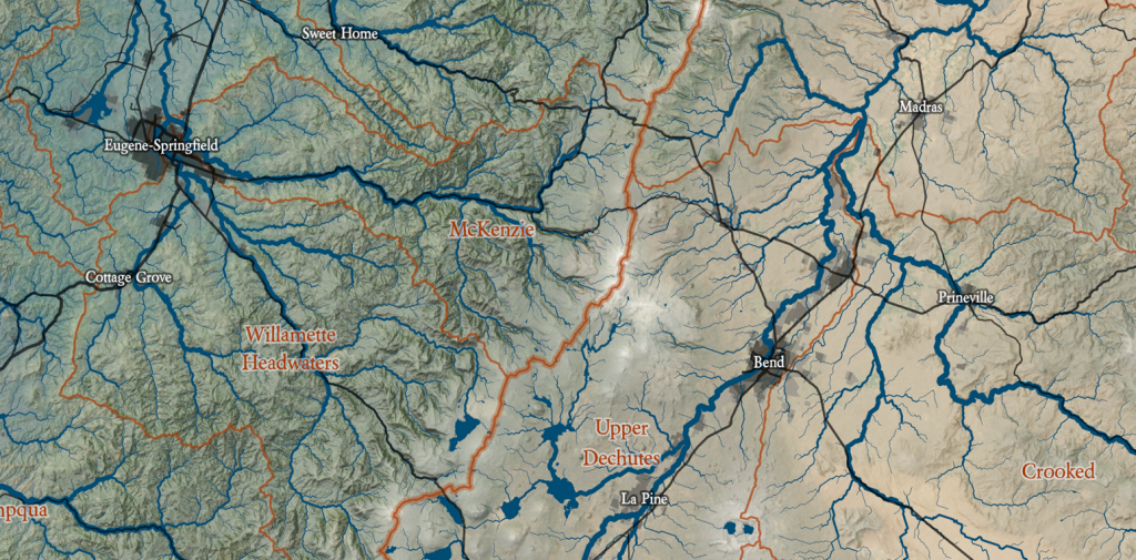
The HydroSHED watershed boundaries use a twelve-layer hierarchy of watersheds within watersheds within watersheds. This lumping and splitting of basin within basin was created by a machine, and has no local nuance. If I used too many small watersheds the map would get too noisy. Too few and the map wouldn’t describe locally meaningful places. I started with what was familiar. I needed to develop some kind of median watershed scale, both to work with the data, and to set the scale of the project. A large Cascade river basin became my standard—Nisqually, Puyallup, Skagit, Nooksack each got their own polygon, and I then set the size of sheet so these polygons would appear uncluttered. East Olympic and North Olympic watersheds got lumped. This all led me to start with the “level 7” hydroSHED polygons. I then proceeded to lump or split anything that seemed awkward based on local knowledge. The large basins of the Columbia and Fraser were split into tributaries and reaches, often larger than the typical Salish Sea basin, reflecting the lower population density and open straight roads. None of the HydroSHED polygons were labeled, and so I named as I went, referencing the US National Map, or the British Columbia Geographic Names App. I had never noticed how very very poorly Google treats hydrology, and Canada in general.
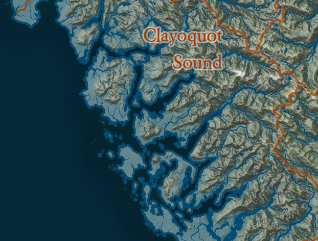
When I got to the fjords of the British Columbia Coast I knew I was in trouble. HydroSHED’s logical but uncaring algorithm uses the saltwater inlets as watershed boundaries rather than centering watersheds on the inlets themselves. This chunks the landscape into peninsulas; mountainous and isolated. These lands, however, are inhabited by canoe people, and boats are still the best transport in the passages, straits, and sounds of the inside passage and many parts of the outer coast. So I loaded the more detailed level 12 sub-watersheds, and started splitting and merging to construct new watersheds, centering on the inlets and sounds as defining the identity of place. That is when I started getting into the shorelines.
In Puget Sound, I am familiar with our high-resolution shorelines, all derived from the DNR shorezone effort, which were used for the PSNERP study that was the beginning of my GIS career. I have never had to hunt for a good shoreline. This landscape is defined by intricate shorelines. The edges of the HydroSHED polygons were lumpy sausage, entirely unsatisfactory. A new regional Shorezone synthesis effort is in development but not ready to plug and play. I was pleased to find that NOAA distributes an unfortunately named Global Self-consistent, Hierarchical, High-resolution Geography Database (GSHHG; or “gas hog”?) I did also found the new Canadian nearshore habitat survey lines (still less than a decade old), but they are not well structured for cutting polygons, and include lots of weird loops and gaps. I used a mix of the NOAA and Puget Sound lines, and constructed an ocean polygon, and used it to clip the clumsy edge of the HydroSHED watersheds and better define the inlets. In some cases hand crafting was necessary. I gave the ocean a crisp border line to match the rivers, and cover up the rusty watershed boundaries where watershed polygons runs along the sea. For nicely detailed maps north of the border, some labor will need to go into the Canadian nearshore.
 For most of the project, I had been imagining a bright blue sea with the continental shelf showing through, consistent with many modern maps. At one point I accidentally flipped the wrong switch and turned the sea a dark indigo. It was beautiful! It took the ocean from an insipid backdrop to a powerful and mysterious edge, staining the shoreline, and playing with the eyes by contrasting with the colors of the land. The appearance of the muse is always lucky.
Settlements and Modernity
I converted the grid into simplified polygons to show these higher density areas in three levels from transparent grey to black. In other maps I have also played with bleaching cities using lighter colors, to show imperviousness like bones. On the varied base layers, the dark rendered better and I kept white for snow. I connected population centers using primarily roads. I thought about adding railroads and pipelines, but that felt like clutter at this scale, and a North American Roads dataset is readily available. There are some inconsistencies between American and Canadian road classifications that would be good to work out, but are good enough for this application.
Labels
The final question: what features should be represented by words? I settled on three elements. At the largest scale, I describe geographic regions, such as the Salish Sea, The Fraser Plateau, the Ochoco-Blue Mountains. Did I lump and split these right? Are these the right names? Is something impartant missing? I have no idea.
I also wanted to name watersheds, and for this there is also no clear convention. I usually used the dominant river name, or if there were a contest, a hyphenated pair, or of too many some defining feature. Watersheds are labeled in a glowing rusty color to match the watershed boundary. I named reaches of large rivers, usually upper and lower, or attempted define some aspect of each place. In my reckless naming, I frequently referenced the BC Geographic Names list and US National Map. I also discovered new Canadian watersheds resulting from the 2015 Water Sustainability Act and let that influence place names and boundaries. Along the Canadian coast, I generally referenced inlets and sounds, or when totally lost, named a few places after a prominent indigenous cultural group, and probably annoying their neighbors. I will piss off someone, and I will regret it. One thing I have learned from mapping, is that there is no single right division of land, and in that context I find it my bioregional duty to get something done, and to poke at any pretense of authority. After 20 years in public institutions and 53 in a capitalist hierarchy, I am very weary of people and their sense of authority. Again, I expect this lumping and splitting and naming will be both endless, and in its gyrations and over time, will deepen my understanding of the unresolvable tensions of place. Please send me your comments and I will read them all.
Finally, I named human settlements, in part to help people place themselves, but with two other motivations. First I didn’t want to clutter populated places with words, and so limited my labeling to larger cities and towns to create a pleasant spacing in populated areas. I also preferentially referenced river towns. For example, Renton and Kent, the poor and burgeoning step-children of Seattle are the market towns of the Cedar and Green rivers, and got their names in print. Outside of the megapolises, I looked for the largest town in each watershed, or perhaps a pair with settlements frequently located at a confluence on a watershed edge (by no accident). This led to naming places that are frequently forgotten on maps that render political power. But in the context of watershed-by-watershed stewardship, these hamlets and villages may be an essential piece of a bioregional civilization. For example, on the Skykomish, I included Monroe, the market town at the confluence of the Skykomish and Snoqualmie, and also Gold Bar, the last village as you leave the lowlands and climb the headwaters. The Grande Ronde Watershed, on the north flank of the Blue Mountains, has a label for both Le Grande and Enterprise. For the Lower Deschutes, Madras is a city on a road and Maupin the river village at an important crossing. The Okanogan international border is marked by the twin villages of Oroville and Osoyoos, perched on the road between Omak and Penticton. Are these all correct? No. Tell me a story for the next iteration.
In Closing
I have lots of ideas for improvement. I’d like to make some lakes in the basin and range into salt flats as they should be. I’d like to clean up the roads. I want to continue lumping and splitting and labeling to tell better stories. But there is also virtue in something finished. I want to move on to my next series and develop human-scale places within this landscape, a series of watershed and regional maps, with similar themes but more details and different stories, probably starting in Puget Sound. If you would like a commissioned piece, tell me a story about what a new map will do for your community and I’ll see what I can do.
This map is released as a free cultural work under a Creative Commons Attribution-ShareAlike 4.0 international license. You can copy and manipulate it as long as you reference my original work (show me some respect), and allow others to do the same to your derivative work (show some generosity). May our love for the land grow and grow.
Download a 113 MB PNG image of the full sheet
